Project Overview
Client: Provida Financial Corporation
Industry: Private Lending / Financial Services
Scope: Brand Strategy, Creative Direction, Visual Identity, Website UX and Content Strategy, Copywriting, Art Direction (Photography & Aerial Imagery)
Provida Financial Corporation (PFC), a private Canadian lender based in Calgary, Alberta, provides alternative credit solutions to businesses across Western Canada. With a commitment to transparency, competitive fees, and fast turnaround times, Provida has supported businesses through both economic slowdowns and high-growth cycles for over seven years.
The company recognized the need for a rebrand that would better reflect its values, experience, and competitive edge in Canada’s non-bank lending space. The goal was to reposition Provida as a modern, client-centric financial partner while retaining its roots in integrity, regulatory compliance, and regional expertise.
This included a comprehensive rebrand and website redesign that would speak to their audience of established business owners and financial decision-makers with clarity and confidence.
Creative process
Brand Discovery and Strategic Positioning
Stakeholder workshops and client interviews revealed consistent themes: responsiveness, flexibility, and a deep understanding of local market dynamics. These qualities informed the new brand pillars — precision, partnership, and progress.
Provida’s unique facility structuring and advisory expertise were framed as key differentiators. Messaging was developed to reflect a consultative, solutions-oriented approach that could flex to meet each client’s unique financial scenario.
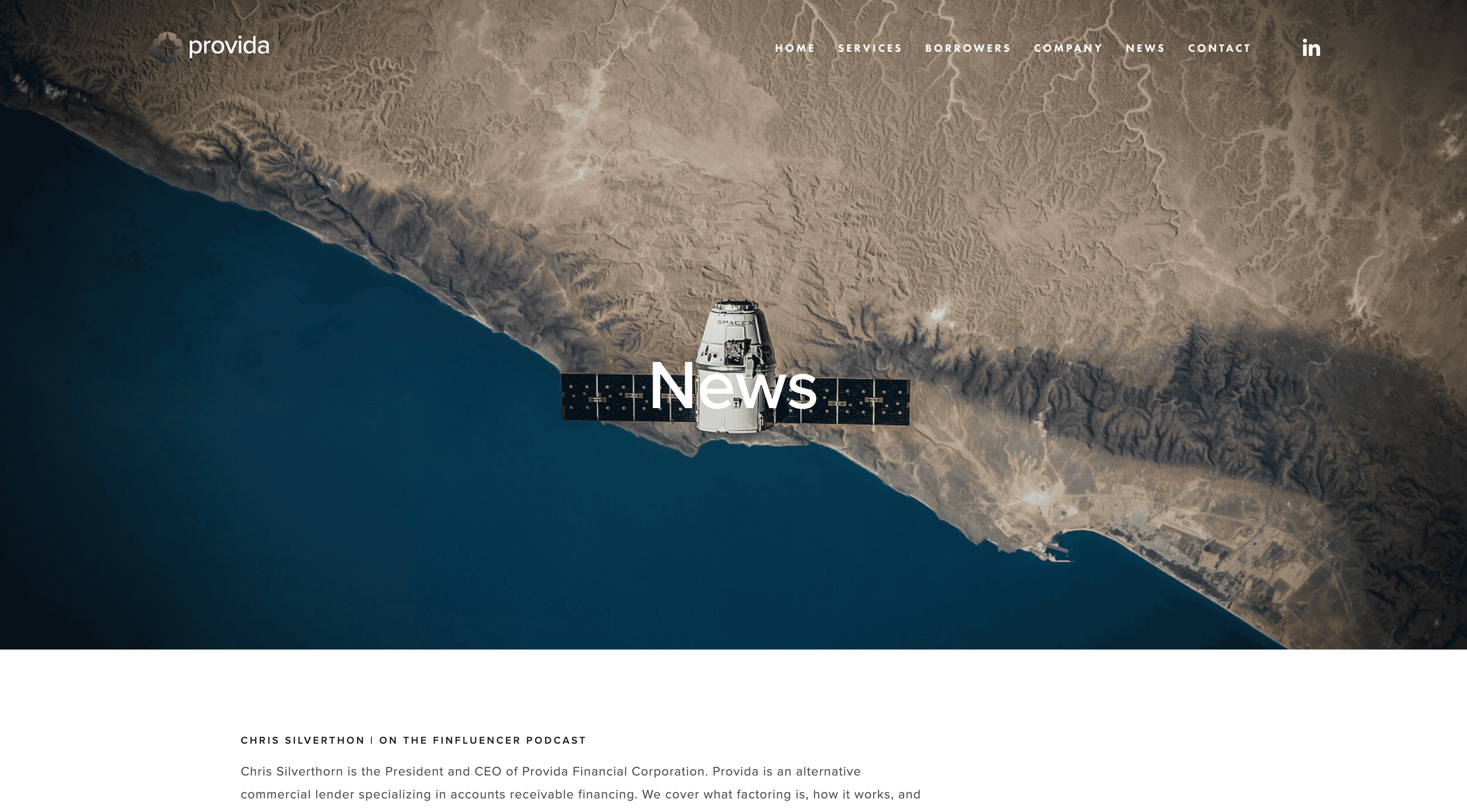
Visual Identity and Aerial Imagery
The visual system was crafted to signal trust and authority while reflecting Provida’s strong regional identity. A new logomark introduced a clean, geometric structure suggesting growth and stability.
Aerial imagery of Alberta’s urban and rural business corridors was integrated into the brand visuals to create a sense of scale, regional pride, and forward momentum. These bird’s-eye perspectives reinforced Provida’s role as a high-level partner that sees the bigger picture while providing targeted, ground-level financial solutions.
The palette featured cool tones inspired by the Western Canadian landscape, balanced with structured white space to convey clarity and order.
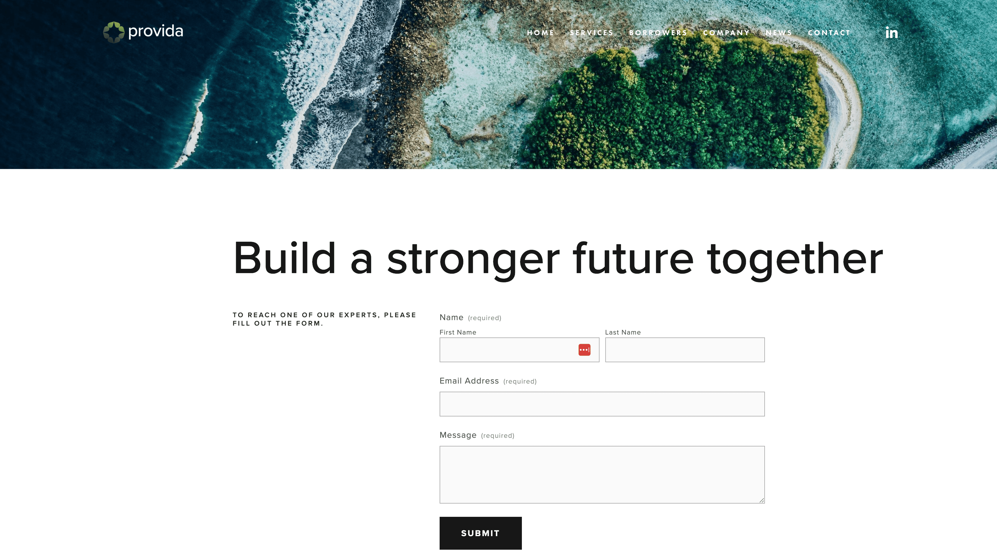
Website UX and Content Strategy
The new website served as a cornerstone of the rebrand. The user experience was streamlined to make financial services easy to explore and understand, whether users were seasoned financial officers or small business owners seeking their first alternative lending option.
The content strategy prioritized plain language, clearly defined services, and educational content. Every page was written to empower users with a better understanding of their options and to build trust through transparency.
Calls to action guided users to connect with Provida’s team, reinforcing the company’s high-touch service model.
Photography and Visual Content
To humanize the brand and establish credibility, custom photography was paired with aerial imagery to showcase both the people behind Provida and the economic environments they serve. This visual balance mirrored the company’s dual strengths: professional expertise and regional responsiveness.